VERS LOGO DEVELOPMENT
- OMH

- Feb 21, 2020
- 2 min read
Updated: Apr 2, 2020

CREDIT - MINE
"We wanted rough and raw but this was too rough and raw."
With our shop aesthetic being dominantly whites, blacks (plus an accent colour or two) also with textures like woods, concrete and construction site equipment, we wanted our logo to follow in this sort of style. We went in search for inspiration and we almost instantly came across images which showed our colour palette's and materials with big bold black text drawn or spray painted onto it.

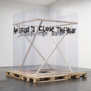


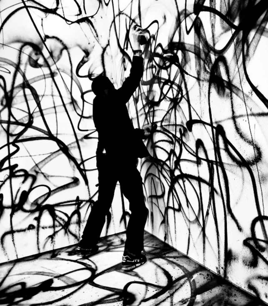
We believed it worked really well with our ideas and it is incredibly cheap to do - Which in a project management project, was a huge benefit. Our next step was to try this ourselves, so we got some spray paint and found some old bits of plastic and wood to see what it would look like.


CREDIT - MINE
We saw there was potential for this style. It was very bold and eye catching especially when it was on a clear background, we thought this could be a good avenue for advertising as it looks like it is sprayed straight onto the wall/window but really it has a background. So we then mocked up some digital ideas and played around with how we could format posters etc.


CREDIT - MINE
CREDIT - IZZI
CREDIT - MINE
Although these were rough concepts we were starting to have doubts about the design style as it was proving hard to get right in real life on the material that we want, and that is just on a small bit of plastic not even on a shop front so the early signs of a problematic variable was showing. Furthermore getting the right affect digitally was hard as it almost doesn't feel right it didn't scream or shout out like we wanted and it started to look like a standard spray paint font off paint which didn't sit well with us.
This meant that we had to come up with another logo, and all credit goes to Izzi for this logo as she had the brilliant idea of using a folding effect on the text which gives it a different perspective that is so cool to look at and is very adaptable to designs.

Our next steps will be to mock up visuals with this logo such as the shop interior/exterior, merchandise, posters and business cards.
https://www.pinterest.co.uk/pin/451556300108375159/
https://www.pinterest.co.uk/pin/654851602054048764/
https://www.pinterest.co.uk/pin/654851602054053210/


Comments