THE VERS RECEIPT
- OMH

- Mar 7, 2020
- 3 min read
Updated: Apr 2, 2020

"Have never liked a receipt so much"
VERS has grown and grown in all fronts over this time period, from a very humble beginning to now a very strong, loud confident middle ground, many things have changed but what is more interesting is what has stayed throughout the transitions periods. One example is our beautiful centre piece, we call it the 'cashier middle piece thing'. This has been the strongest part of our idea in terms of interior installations as it acts like a centre piece for the shop, wether if it is a functional cashier, animation station or DJ booth, it will be at the heart of every event and residency we do there, it has been our rock throughout and has allowed to construct other ideas from it which is always helpful when trying to come up with an entirely new shop space that revolves around changing very frequently...

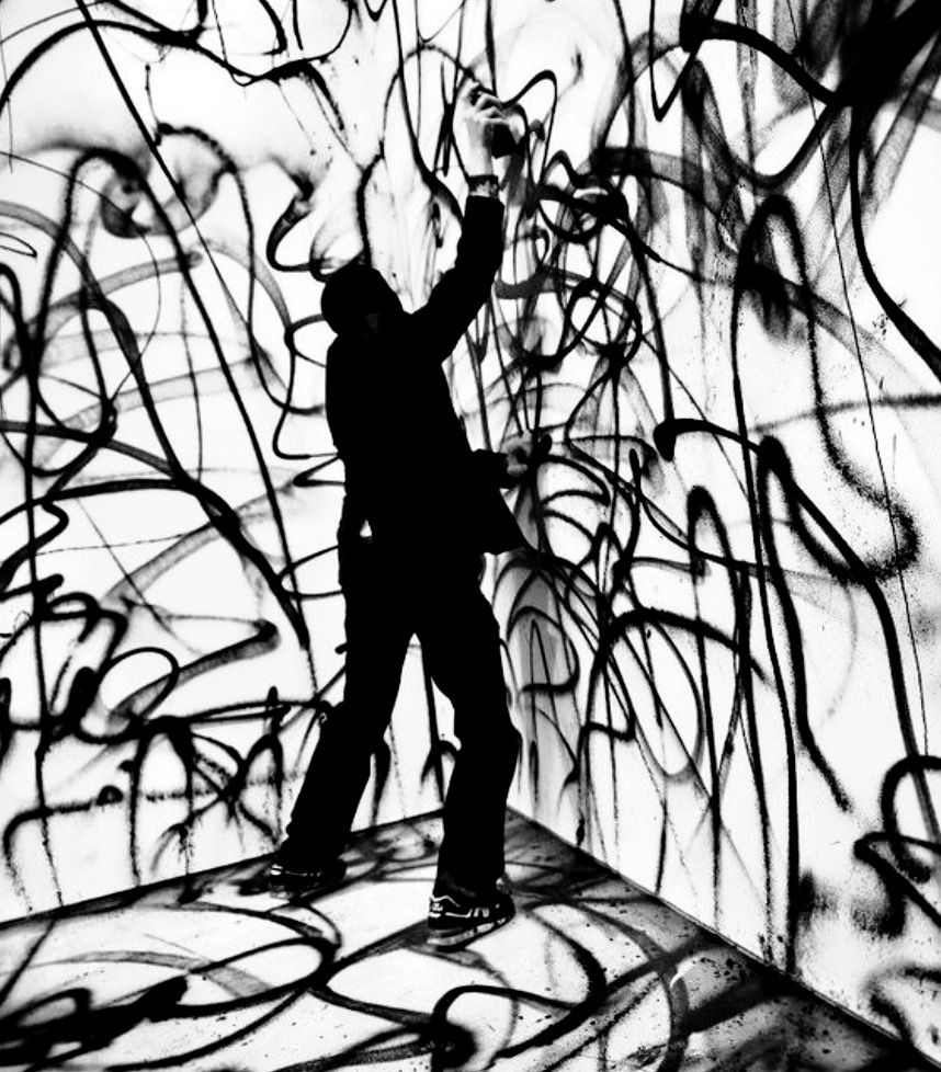
CREDIT TO IZZI FOR THE ILLUSTRATION
Another example of what we have always loved and wanted in the shop is the idea of using receipts as more than just a receipt this is because they are really simple, effective and globally known meaning it can suit everything from posters, price tags and even bigger installations. It also went perfectly with our shop aesthetic of being rather industrial, VERS is based around versatility and being able to change the shop interior quickly and efficiently through specifically chosen features, meaning there are a lot of natural tones like wood and concrete, then our products follow the same idea such as our MadeByLegs jewellery that can be seen to be industrial as well. This all helped the Receipt firmly cement its spot in our project.
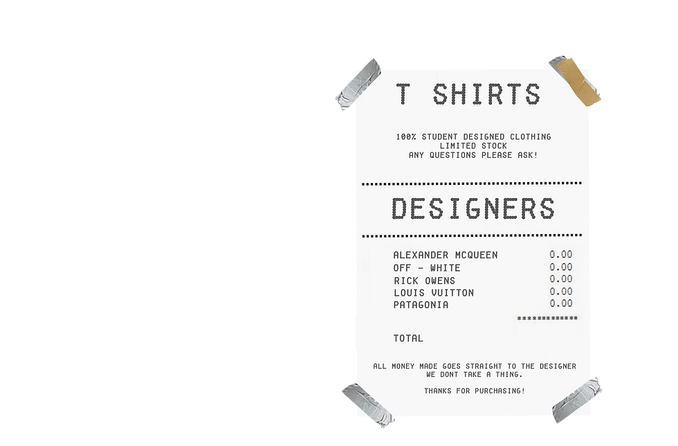
This is an earlier design which gives the message of what we are wanting to use the receipt for, as you can see it has the category at the top, information, the sub category then the designers listed in a row as you would see on a receipt with your groceries. Again, because it is such a known format it is so easy to understand but because it is now a poster listing brands it is now a new, fresh thing to look at.

My latest version of the receipts now include the VERS logo which makes it look extremely professional and I am thankful that both typefaces go so nicely together. Development of the texturising of the receipt background makes it look far more realistic compared to the previous design as well as using off tones of whites and blacks to create the look and feel of a real receipt that has been used before.
Using this receipt lay out allows for easy understanding of what is important and what isn't, the categories are bold and obvious and on the other hand the social medias and other smaller information is located at the bottom or just under the logo, which is where it always is and always will be on a receipt.

This is the receipt price tag we are wanting to use throughout the VERS shop to show the item size and price as well as the social medias at the bottom. Like I have said prior, the receipt allows for a really good consistent lay out and design that can run throughout the shop and onto our marketing very simply and easily.
Overall I do really like using this receipt format as it is no faff, no nonsense design work that does the job perfectly while still showing a nice colour palette as well as type facing going hand in hand, and it is clear that my design development came through nicely as the first mock up doesn't hit the mark at all, yes it looks okay but it isn't the real thing and does look like a fake, whereas the newest mock up is far more realistic.
https://depositphotos.com/127754990/stock-photo-empty-concrete-room-wall-and.html


Comments