VERS INTERIOR
- OMH

- Mar 8, 2020
- 5 min read
Updated: Apr 2, 2020
"A living, breathing creative workshop. "
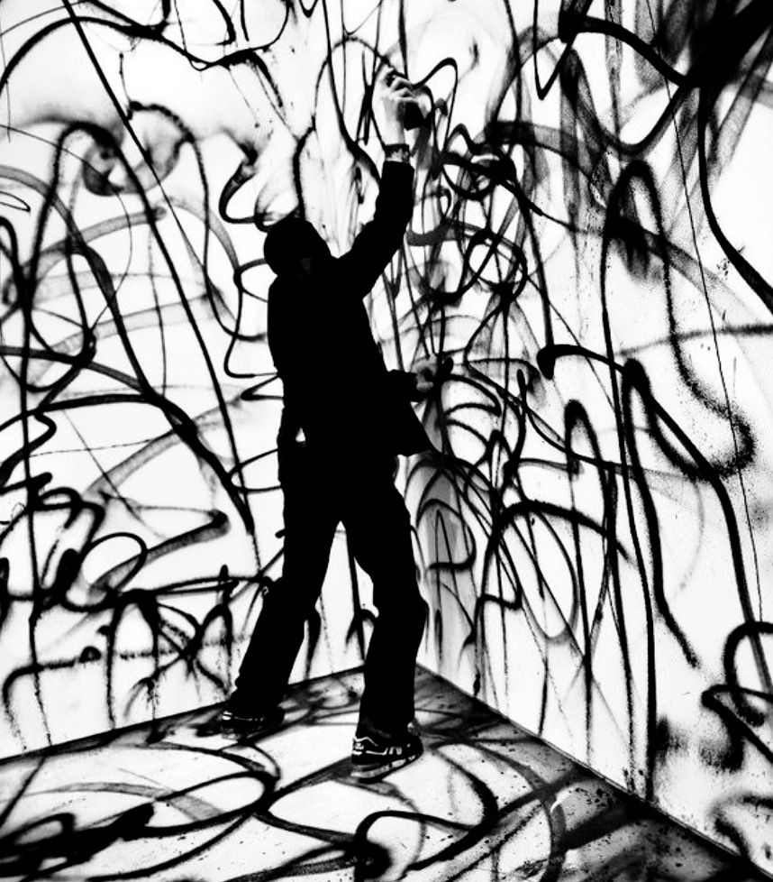
VERS has always been about bringing what it is like to be a student to the public. The creative process, the fun, the noise, the aesthetically beautiful and the rough industrial environment that makes ideas spark. If you look at my previous blogs on the inspirations for the shop I used the Alexander McQueen S/S 1999 show as an analogy of the life of a student, the beautiful, angelic lady in a pretty white dress being sprayed by two huge robotic arms gives sense to what life is really, especially as a student - I was once a gentle innocent flower now I've been attacked and changed by time and technology, but now I am a completely new thing with elements of both... Savage beauty.

Through our research in Shoreditch and group discussions we were able to come up with strong concepts for what our interior should look like. Focusing on the industrial aspects that we have seen in Brick Lane such as using concrete slabs, pallets, scaffolding and chains to give a feel of minimalism but up most functionality as our main aim is to make the space as adaptable as possible so having lo-fi features that are easily sourced, stored and fitted is top priority.


CREDIT - MINE
The use of nature, coloured LED lights and soft furniture like sofas are important in our design as they break up the cold raw material, which is beautiful and I love but to be a functional space we need elements that make people feel warm and homely meaning they'll stay for longer and when they leave, they'll want to come back.
Showing the interior installations I wanted to use a uniform concrete room as I believe it helped reinforce our ideas of wanting to use raw materials throughout our space from the wood shelves, wood and corrugated plastic centre piece and even to the industrial style products we will be selling.


(First picture is what I started with. Second is the final interior).
As you can see our idea of industrial, raw material is seen throughout. Starting from the left we have the interchangeable wooden shelves which can be adapted to fit the need of the residency or workshop a that moment - Need more display space? Put more shelves up. Need less? Lets take it down. Simple. To the right of this we have the scaffolding chain style clothing racks which will stock our student clothing, as well we can see a chain hanging a clothing piece, we want this to be specially for iconic, important pieces, say a fashion designer from KSA has made an award winning piece, this will hang on its own just like a display in an exhibition. The chain and scaffolding approach is due to the desire for our certain aesthetic but also because it is simple and cost effective furthermore they aren't fixed they will be clamped to the ceiling using the clamp mechanism that is above (the 6 smaller pictures from Shoreditch). Moving on from that we have our wooden pallets which can be used for, well anything really, shoe displays, seats or if we don't want them in the space for the month? Bonfire time. Last but not least the hanging plants were inspired by our trip to Shoreditch, we knew we wanted some greenery in the shop so when we saw these we instantly knew that is what we wanted.


(First picture is what I started with. Second is the final interior).
The next mock up is the seating area which we want to have in our space. This is a vital part of making VERS more than just a shop but a social hub where people can come and create, socialise and be in an envrionment where they find exciting yet relaxing. Using pallets as the base of the furniture so they can be dismantled and moved without any expense pushes our shop versatility even further as removing those will then create an even bigger space for events or residencies alike. The graffiti wall is one of my favourite parts as we want it to coordinate with the residency that is happening, the wall being a canvas to create allows the residency/workshop that is taking place to make VERS their own, maybe they want to create patterns or interesting graphics, maybe they just want to graffiti over it - We want this change and we want this random creativity in our space as it will keep it extremely refreshing to the public and to the regulars that visit the space. As you can see again our hanging plants are here, they will be a big part of the ceiling, but again, they are on chains and clamps they can come down. We want to create a space that everything is made by students and everything is for sale, if someone likes the painting on the wall, they can buy it, if they want the furniture they are sat on, they can enquire about purchasing it. This allows for even more stock to come through VERS and I have definitely had it in shops where I like something, maybe the only thing the store I like and I ask about it but 'It isn't for sale im afraid' ????!!! Why is it here then?


(First picture is what I started with. Second is the final interior).
Here is where we see the VERS wall dividers in action. I designed these following our business cards (see below) style using frosted acrylic and our type face to create a sharp, shard looking wall divider that helps us create walkways, exhibition spaces and separate areas within our shop to completely transform it. As you can see, this is the seating area, but now because of the dividers and ability to take pallet furniture away easily, it is now a smaller seating area with an artist creating in the new separate part.


(First picture is what I started with. Second is the final interior).


BUSINESS CARD - CREDIT TO IZZI FOR MAKING THESE


(First picture is what I started with. Second is the final interior).
This is the projector corner where we are wanting to create a space where people are emerged into the videos of creative processes, events, workshops and anything that we think shines a light on what creative students do. For example, the projections on the walls are of BLOX's first shop installation and how they marketed and installed it (see blog on BLOX). VERS are striving to bring this style to our space as it is extremely organic and natural while shining a light on what goes into making a brand or creative project. I really like this as it shows it can be done If you just put some hard work in and take the opportunities presented.
To summerise I believe the interior design is strong and is extremely believable and doable, through the use of affordable, adjustable and efficient features we can keep our space changing to whenever our residencies occur. The aesthetic is attractive which will draw people in whatever demographic as everyone will be interested in this new creative space where everything Is student based as well as having a strong style to separates us from any other high street shop. I believe I visualised our ideas well by using photoshop and Izzi used illustrator for the floor planning and other interior features, joining both together gives our overall creative visuals depth and can showcase our work effectively.
https://depositphotos.com/127754990/stock-photo-empty-concrete-room-wall-and.html
https://www.freeimages.com/premium/abstract-white-interior-of-empty-room-with-concrete-walls-1710579
https://www.dreamstime.com/stock-illustration-empty-room-white-walls-concrete-floor-ceiling-abstract-interior-painted-rough-d-render-illustration-image63881199


Comments