INITIAL CONCEPTS FOR CREATIVE DELIVERABLES
- OMH

- Mar 1, 2021
- 3 min read

After figuring out what I needed to do to make PROJECT X a complete project, I went to find inspiration for what I can put in my 'business plan' regarding creative content.
I have drawn them out and will explain them with the inspiration reference.


I found this poster on Pinterest and I love the simplicity of it but what I really love is how they have made a liquid affect with lines and different shades of colour, it is extremely effective and looks very impressive. I really want to recreate it but instead of it being just black and white liquid lines I want it to imitate liquid stainless steel and then have the knife in the background, which will be for PROJECT X's initial creative workshop of melting down knives and making and selling rings made out of them.


Although there are many variations of this image, the idea of cutting a face up and showing only a few parts and editing the sizes and placing of the squares is a really nice visual for many different reasons.
What I want to do is to have an image of a youth of London (the stereotypical look of a 'youth' in the UK today - hoodie up, dark clothing) and do the same edit with the photo. But furthermore, I want to then annotate it with phrases or key words that the media describe 'gang members' or young kids who are stuck in the 'road' life with or without choice. The choice of words in which the mainstream media choose to use is disgusting and adds fuel to the fire of demonising young individuals in the UK which only causes more hate and divide, while giving no help to finding the solution for the problems. (See research blogs to see in more detail).


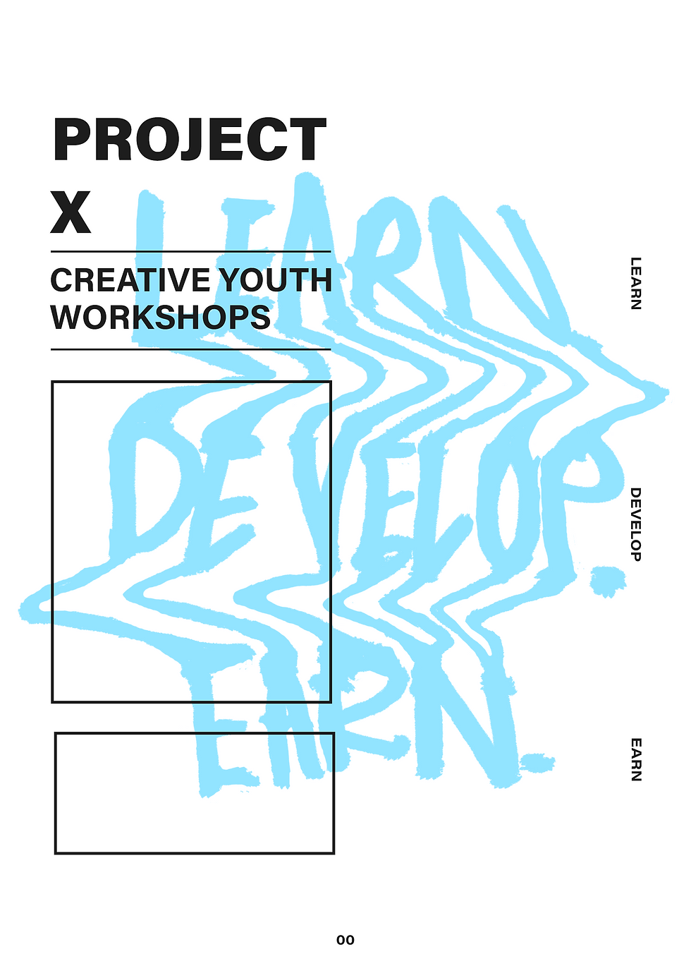


This one is more general but these images have inspired me to push what I go for regarding my layout and put more effort into making it far more than just a document. Like I said in my previous 'refresh rebrand' blog I want to create a business document that is clear and simple but also incredibly nice to look at. These images above focus on using an abstract colour and the use of a different 'tool' such as hand written writing, painting, strokes or high lights to break up the black and white and gain the viewers attention to certain parts.
However it is early days and I don't think that I like the visual in the back and will be changing that. I do like the use of the blue but the visual is a bit of a copycat and it doesn't sit right with me, but it was good to try it anyway.


I also really liked the architecture drawing visuals, I think they are really intriguing and look simple and clean but also very complex at the same time? I want to re create one and make one of what a PROJECT X workshop would look like - With all the equipment and professionals there available for anyone who goes to use and create. I would then do a 3 layer building and each layer would be one stage of 'Learn' 'Develop' Earn', so each floor would have to have the different stages of creating a project/product and bringing it to life.
I thought the architecture drawings were simple and easy but like everything to do with photoshop, it isn't and working with just the line tool in photoshop is pretty excruciating.
I am playing with other layouts such as this table of content page which uses the project x text layout above but is a bit more simple and 'professional' - It is just black and white, black being the background, which I seem to always do, so I want to make sure to move away from that, however for now I like it and gives me a direction to push on with.


Comments